Shirley's
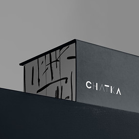
Visual identity & packaging design for West African food brand

Industry
Food & beverage
Services
Visual identity
Packaging
Project duration
1 month
Location
United Kingdom
Year
2025
Shirley’s is a West African food brand that bridges the flavors of West Africa with British kitchens. Offering authentic Jollof paste, it brings rich, vibrant tastes to a wider audience - celebrating heritage while embracing inclusivity.

Starting point
Shirley's was born from a mother's determination to bring authentic West African flavours to her family. She needed a way to preserve cultural food traditions despite limited time.
The goal was to create a brand rooted in West African heritage while remaining inviting to a broader audience - an accessible, flavourful experience for anyone seeking a taste adventure.


Challenge no.1
How to position Jollof as a go-to meal in the UK, as familiar as for example chicken chow mein or curry?

Challenge no.2
How to blend West African tradition with modern British lifestyles to appeal to both heritage-rooted and new audiences?

Challenge no.3
How to connect with time-poor food lovers, West Africans abroad, and health-conscious eaters looking for flavour without the fuss?
How we approached it

From the beginning, it was clear this brand needed to feel authentic to its roots while also welcoming a broader UK audience. That meant listening carefully, challenging assumptions, and making sure every decision respected culture while still working commercially.
01
Listening first
We started with conversations. Through a detailed questionnaire and open discussions, we explored Shirley’s story, her motivations, and the long-term vision for the brand. We also exchanged cultural references - food traditions, rituals, everyday habits - to understand what felt essential and what could evolve.
02
Testing the positioning
We reviewed the market research the client had gathered and consulted additional voices - a small focus group approach - to test whether positioning Jollof as an accessible, everyday UK meal could genuinely resonate.
03
Immersing in West African heritage
We then deepened our research into West African visual culture. We studied alphabets, symbols, and patterns, including Kente cloth traditions. The “Gye Nyame” symbol was especially important to Shirley. Our task was to honour its meaning while subtly adapting it - allowing it to sit confidently within a modern British context.
04
Translating heritage into a contemporary brand
With clarity on positioning and symbolism, we shaped a visual identity that blended warmth, familiarity, and authenticity.


What changed
The identity gave the brand stronger shelf presence while honouring cultural symbolism with care. Most importantly, the brand stopped feeling like it had to explain itself.


Working with The Blooming Fern on our brand book was an exceptional experience. As a West African food brand striving to bridge tradition with modern convenience, we needed someone who could understand and translate our unique vision - and The Blooming Fern delivered beyond expectations. From the outset, they demonstrated a deep understanding of how to balance our cultural heritage with contemporary design elements.


Notes around the project

by Zofia Ciupa ✦ 16 Sep 2025
Do you really need full branding for your business?
Not every business needs a full brand identity from day one. Or do they? This article breaks down the difference between simple and comprehensive branding - and how to decide what actually makes sense for your goals and/or stage of growth.